 A Radio World ebook explores “Recipes for Visual Display.” This is an excerpt.
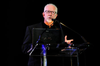
Fred Jacobs founded Jacobs Media in 1983. He created the classic rock radio format and was the first radio consultant inducted into the National Radio Hall of Fame. In 2022 he and his brother Paul received the NAB National Radio Award.
Radio World: Have broadcasters gotten the message that you’ve been preaching for years about visual display?
Fred Jacobs: There are times while I’m in a car where I get buoyed by how some stations are using their metadata. It can be comparable or even better than how SiriusXM or Spotify displays their channels or music.
But there are other cases where I scratch my head. It can be a case where a station is supporting their audio with a lot of sales graphics and text at the exclusion of programming content. There are other situations where nothing is being done. In these latter examples, all I can assume is that no one in management drives a late-model vehicle with a nice infotainment system, they don’t realize they can affect the way their station looks on car dashboards, or they just don’t think it’s a big deal.
RW: What’s a feature or capability that metadata makes possible but that broadcasters may not be taking advantage of?
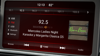
Jacobs: Displaying the artist and title of a song is now table stakes in the car. In vehicles equipped with HD Radio with the Artist Experience feature, so is the thumbnail picture of the album artwork. Where the metadata gets interesting is in conceiving other ways to display programming features — pictures of personalities and shows, graphics for station features, emergency information, etc.
While programmers have to guard against “over display,” the fact is that for many stations, metadata that attractively shows content is a plus. On a spoken-word station featuring a strong guest, letting the audience know who is being interviewed can be additive, too.
A key is that programmers need to start proactively thinking about how and where metadata can support and enhance what is on the air. It is a mindset issue — most PDs have not been trained or taught to even consider the dynamics of metadata. It’s a huge opportunity, especially given the attention most drivers pay to their dashboard screen. And at this time in radio when marketing dollars are at a premium — or nonexistent — metadata can be attention-getting, top-of-mind, and even occasion-setting.
RW: What resource would you recommend to readers?
Jacobs: The first edition of the NAB’s “Digital Dashboard: Best Practices Report” was put together by me, my brother Paul and engineering guru Glynn Walden. It’s been updated a number of times, most recently in October 2023. You don’t have to be a member of NAB to download a free copy here.
It’s a simple but comprehensive DIY guide to aligning your radio station’s metadata in a consistent and attractive way. Many people who work in radio don’t realize how much control they have when it comes to dashboard messaging. I would recommend that broadcasters start with this guide and go from there.
The second piece is to conduct your own audit in your metro. Sit in a well-equipped vehicle — or two — and scan from 88 to 108. When the radio lands on a local station (or HD2), stop the scan and wait for the metadata to populate; it may take several seconds. Make note of who’s displaying what, how it looks and works, and is it something you want to emulate or improve upon. In a typical market, there will be a wide range of metadata and quality display from the sharp to the abysmal. How does your own display match up, and where and how can it be better?
Another idea is to line up five or so vehicles in the station parking lot that can all display artist and title. One or two should be late-model cars. Then wait for an element on your station to air (like a song) and compare how that looks on all five dashboards. They will likely vary by make and model, giving you (and your engineer) a better understanding of the challenges and opportunities with metadata.

RW: What’s the most common mistake or error broadcasters make in managing metadata?
Jacobs: It’s important to keep metadata messaging simple and short. Anybody who spent time with Twitter during the early years came to understand the challenge of crafting a tweet less than 120 characters. It requires practice and repeated editing.
It’s the same with metadata. Dashboard “real estate” is highly limited, and there’s very little to no standardization across the various auto companies. It’s similar to designing a billboard, where you quickly come to realize the fewer words (and the shorter words), the better. It takes discipline, clarity and editing to communicate effectively on the screens in most vehicles on the road today.
RW: Do you have a best practice that you’d like to call attention to?
Jacobs: I like to use metadata that is in the moment, that can even drive an emotion. When programmers look at opportunities to tap into shared experiences, perhaps around holidays, during weather emergencies or even the changing of the seasons, the right message on a dashboard can be almost communal. Yes, it’s great to display album artwork or a sponsor’s logo, but connecting with drivers when they’re listening to radio in the intimacy of their cars is special.
Read the ebook “Recipes for Visual Display.”
